On average, an office worker sends 40 emails per day. But what if each of these emails could be more than just a part of daily communication, but also a potential marketing channel?
That's where an email signature banner from an employee could significantly boost clicks and impressions for marketing campaigns.
But do email recipients really pay attention to elements beyond the standard email signature? How are additional visual elements like a banner in the email signature perceived?
Drawing from the results of an eye-tracking study conducted at the University of Zadar, we delve deeper into email signature banners. We speak with Mate Juric, Assistant Professor at the UX Lab of the University of Zadar, about the findings and how marketers can leverage signatures to support their marketing campaigns.
![]()
“Our research indicates that well-designed banners enhance the email experience and overall interaction, without detracting from the original email content.”
Mate Juric, Assistant Professor at the UX Lab, University of Zadar
Study overview
Can you provide a brief overview of the study?
Mate Juric: "Our study focused on two main questions.
Firstly: What attention is given to the signature in an email, particularly concerning the presence of a banner in the signature? Various arrangements were examined, such as banner and signature, signature only, and signature with hyperlink.
Secondly: What motivates people to click on a banner in an email signature? To investigate this, we conducted an experiment with different pairs of banners and asked participants to choose the one they were most likely to click on. At the same time, we analysed their eye movements and created questionnaires about their perception.”
Perception of signature banners
How has the addition of a signature and banner changed the perception of an email?
Mate Juric: “Based on the eye-tracking data, it's interesting to note that there was no reduction in the reading time of the email text. Participants still read the entire text of the email and then viewed the banner.
![]() Example of an eye-tracking recording: The circles represent eye fixations. Reading and perception occur during these times. This indicates where the participant's attention was directed while reading the email.
Example of an eye-tracking recording: The circles represent eye fixations. Reading and perception occur during these times. This indicates where the participant's attention was directed while reading the email.
They first read the email text, then noticed the banner, returned to the text, and finally read the text on the banner. This result was positive, as the banner did not distract from the important information in the email text but rather provided useful additional information.”
"Participants reported in surveys that the banners were appealing and trustworthy. For marketers, this presents an untapped opportunity, as they can leverage this positive attitude towards banners by offering engaging and contextually relevant content."
Effective banner design
How should banners be designed to encourage email recipients to click on them?
Mate Juric: "Our research findings provide practical insights for marketers looking to create visually appealing and effective email signature banners. There are some elements that appeal to target audiences and enhance campaign performance.
Our data show clear preferences regarding banner design. Pastel colors were preferred over neon, and darker backgrounds over lighter ones. Banners featuring faces and clear call-to-action buttons achieved higher click-through rates.
.png?width=1200&length=1200&name=Person-noPerson%20(1).png)
.png?width=1200&length=1200&name=nonCTA-CTA%20(1).png)
.png?width=1200&length=1200&name=Pastel-Neon%20(1).png)
.png?width=1200&length=1200&name=Dark-Bright-background%20(1).png)
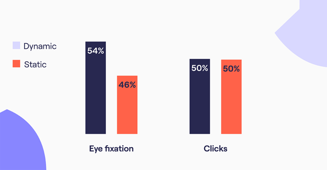
Interestingly, dynamic (GIF) banners and static banners were clicked on equally. However, the number of eye fixations was significantly higher for dynamic banners. So, dynamic banners are effective in grabbing attention in emails with a marketing message.”
Design checklist for signature banners
The study results highlight which design elements are most effective in increasing clicks on signature banners:
- Use colours that contrast strongly with white.
- Use of images that show people.
- Incorporate eye-catching CTA buttons.
- GIF banners are ideal for awareness campaigns focused on branding.
Surprising Results
What surprised you the most about the results of the eye-tracking study?
Mate Juric: “The fact that the majority of participants preferred the version with the banner was surprising to me. We are very sensitive to any form of advertising today. However, the surveys conducted during our study indicate that participants find the emails appropriate and even prefer emails with banners.

The 50:50 click preference between dynamic and static banners was also surprising. It shows that the choice between these two types of content strongly depends on the specific campaign and desired outcome.
This is something that marketers should consider for their campaign objectives:
"GIF banners attract more attention but not necessarily more clicks. They are excellent for awareness campaigns, but if the goal of a campaign is to increase clicks and conversions, marketers should focus on other elements when designing banners."
Additional tips for marketers
What else should marketers consider beyond banner design?
Mate Juric: "Beyond just designing banners, marketers should always keep the context of their banner campaign in mind. This encompasses two crucial aspects:
"It's important for the content of the banner to align with the content of the email and the sender's message. Therefore, the banner should not only be visually appealing but also fit into the overall context of the email."
When the content of the banner directly relates to the main theme of the email, it is likely to be better perceived and understood.
Another important aspect is considering the buying phase the customer is in. Depending on whether the customer is in the initial phase of decision-making or already in the final purchase consideration, banners can be designed differently. Targeted messaging that addresses the needs and questions of the customer increases the likelihood of a positive response."
"The successful integration of banners into email signatures requires not only aesthetic design but also strategic alignment. By considering the contextual relevance, marketers ensure that their banners not only stand out but effectively reach and influence the target audience."
About this study:
This study was conducted on behalf of Mailtastic.
Metrics used included eye-tracking metrics such as fixation count and subjective metrics on a 5-point Likert scale to evaluate factors such as click intention and banner liking.
The study utilized the Tobii Pro Nano eye-tracking device to ensure accurate data capture of participant gaze behavior.