22 Eye-Catching Email Signature Examples for Every Industry
The business emails you already send are one of your biggest untapped marketing opportunities.
That’s why adding a new email signature to your business emails is a simple, yet powerful way to maximize revenue by nurturing the client base you already have.
Your Business Email Potential, Reimagined.
Stylized business email signatures are known as “email signature marketing” – and they play an essential role in your overall marketing strategy.
Your own signature should be so much more than a forgettable sign-off. Instead, it can showcase personality and win customer interest.
Your new email signature will function as a micro-profile, a marketing hook, and a clickable business card, all in one.
The Best Email Signature Examples
No matter what your line of work is, there’s an email signature design for you. Here are some examples to get your imagination going. What features will you include in your new email signature?
Marketing Manager Email Signature

In true marketing fashion, Jasmin put her best foot forward by including a catchy tagline and a clickable call to action next to her company name and logo. You can’t miss it!
Global Operations Executive Signature

Darius’s signature is clean and professional. Matching the color palette with the company’s visual identity is an excellent idea to establish consistent branding. This particular signature also makes it easy for recipients to get in touch with Darius in any other way they want—be it via social media, phone, or website.
Consultant Email Signature

Oscar’s email signature is professional, but it isn’t stiff. His winning smile puts everyone at ease, and adding his preferred pronouns helps clients learn a little more about him right from their email inbox.
Sales Representative Email Signature

Amanda’s signature is easy on the eyes. It features mostly soft, complementing colors, and a consistent theme that matches the company logo. For her call to action, she’s chosen to advertise a sale that encourages the viewer to click.
Lawyer Email Signature
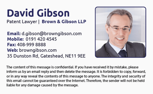
Mr. Gibson has to leave room for a detailed disclaimer at the end of his email signature for legal reasons. But he makes up for it by including a personable headshot, and by keeping the design simple so there’s not too much going on.
Brand Manager Email Signature

As a brand manager, Stephen’s specialty is maximizing your success. That’s why his signature design includes everything you need to contact him but focuses heavily on inspiring the client’s confidence by providing an educational video that’s clickable right in the signature itself.
CEO Email Signature

CEOs have a public image to maintain, which usually means their mail signatures call for cohesive branding. Ms. Parker reinforces her personal brand by using the same color throughout her signature, as well as links to her social media profiles. They help email recipients can get a glimpse of her life outside of the business world.
Photographer Email Signature

Since Damien’s small business is all about beautiful pictures, he brings stunning visual impact to his email signature by showcasing a few shots from his portfolio. For a personal touch, he adds warm wishes to his signoff for a warmer customer connection.
Author Email Signature

This signature is ultra professional, but the illustrations add a dash of creativity. Vicky’s headshot communicates confidence and talent, and the large banner underneath her contact information keeps her contacts interested by teasing her current work in progress.
Realtor Email Signature

This signature is action-packed but concise. Mia consolidates her social media profiles and contact information to leave enough space for the hook: some impressive current listings that show off her expertise!
HR Consultant Signature

Eva’s signature has a classic look. But what really grabs your attention is the large contrasting graphic that says “hiring,” followed by a link labeled “apply here.” Together, they act as a powerful focal point and a double call to action!
Doctor Email Signature

Dr. Rose’s signature gets straight to the point. Her profile picture instills confidence, and her contact information is laid out nicely. But the eye is immediately drawn to the oversized CTA button that encourages the recipient to book an appointment.
Music Store Owner Email Signature

Zoe’s signature stands out. Her colorful and engaging photo brings an artistic element that suits a musician’s profile, and its placement at the center of the signature makes it even more prominent. You’ll be clicking those YouTube and SoundCloud icons straight away!
Chef Email Signature

Hiromi keeps the text to a minimum on this sleek, clean, and appetite-inducing email signature. This is a great strategy for a restaurant owner since it leaves all the attention to the appealing photos and the invitation to book a table.
Blogger Email Signature
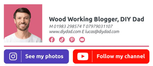
As a blogger and DIY guy, maximizing social media connections and building a personal brand are Lucas’ biggest priorities. That’s why he chose an animated GIF for his name—as if he’s jotting down it in real time—as well as oversized social media icons that also function as calls to action.
Professor Email Signature

Prof. Hilbert’s signature is crisp and inviting, thanks to a friendly headshot and a simple layout that’s easy to read.
Online Seller Email Signature
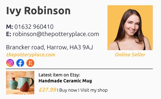
Ivy is looking to draw more traffic to her online shop, where she sells handcrafted goods. Her signature features a beautiful photo of her latest and greatest creation to give email recipients a taste of her talent and pricing. Her two calls to action invite clients to either buy or browse.
Ecommerce Email Signature
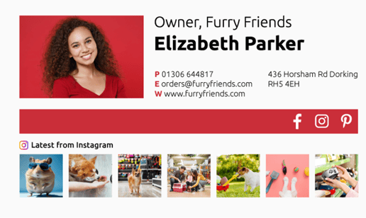
As an internet-savvy small business owner, Elizabeth knows that many of her customers first discover her on Instagram. Adding a preview of her latest Instagram posts is the perfect way to bring her strongest marketing platform right into her email signature. That picture-perfect Instagram feed is working overtime!
Graphic Designer Email Signature

This email signature is the perfect example of “simple but effective.” There’s not too much to look at, and the clickable CTAs are very prominently displayed. Plus, going for all black-and-white fonts and buttons really makes Rebecca’s personality pop in her colorful headshot.
Bakery Owner Email Signature

Baking is a hands-on creative calling, so Melissa went with a tutorial video on her email signature instead of a professional headshot. That left plenty of space for a more prominent business logo to boost brand recognition. Check out how Melissa customized the placement of her social media icons to add interest to her bakery’s official logo design!
Web Developer Email Signature
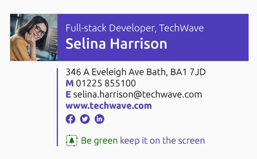
Selina chose a simple, angular layout for her email signature, but brought a little life to the design by adding a pop of color and a spunky (yet professional) portrait.
Customer Success Email Signature

Customer success is a highly collaborative profession, which is why Rico’s contact information details take a back seat to more engaging elements: a friendly headshot, a call for customer feedback, and a link to an educational post to help clients increase customer engagement.
Animator Email Signature

Martin’s email signature is bright and lively, just like your favorite animated videos! All Martin’s contact info and icons linking to his creative channels on YouTube and Vimeo are front and center. But in case you don’t click those, an embedded video showcasing some of Martin’s best work is sure to get plenty of clicks!
What Goes Into A Basic Email Signature?
Creating a professional email signature is all about leaving a lasting impression on the recipient. But along with punchy elements like graphic design and the perfect photo, you also need the right pieces of information.
Here are the elements to add when designing an effective email signature:
- Your full name, job title, and the name of your business (preferably along with your company logo).
- Contact information, including your website, phone number, and email address.
- A flattering headshot or photo. Try to communicate professionalism with a personable twist!
- Social media links that lead to social media profiles that are relevant to your business specifically (such as LinkedIn, Instagram, Facebook, etc).
- An engaging call to action (CTA) that encourages the reader to click. (Examples include: “book now,” “learn more,” “request a free demo,” etc.)
- A disclaimer, if necessary.
If you’re paying a provider for an email generator service, make sure it’s worth your investment by verifying that they include these features:
- Full editing capabilities, including ability to customize font type, size, and positioning.
- Ability to seamlessly operate the signature generator while composing a new message in your email account.
- A logo editor that enables adjustments to the business logo included in your email signature
- Ability to edit rich text—also known as a “what you see is what you get” or WYSIWYG editor.
- Ability to create and switch between multiple versions of your email signature and to choose a default signature.
- Option to add clickable social media icons, buttons, animated GIFs, and preferred pronouns.
Top Tip: Choose a Great Photo
We could show you one hundred professional email signature examples that are each fantastic in their own right. But your signature will have a personal spin that only you can bring—and it all starts with your photo.
Don’t make the mistake of leaving it out! A good profile photo will increase your email conversions by establishing an emotional connection with your prospective customers.
The right photo for you will depend on what your line of work is. If you’re an entertainer or a baker, for example, you might pick a picture of you doing what you do best. That way recipients see a snapshot of your skills in action without even visiting your website.
If you hold a corporate position or offer services that aren’t as picturesque, a professional (but not boring!) headshot is the way to go. Use your best judgment, get feedback from friends and colleagues, and have fun with it!
Next Up: Dynamic Details
Use what you know about what drives sales for your business, and figure out how to incorporate it into your email provider’s signature.
This doesn’t mean you should pack the signature with too much information—that will harm its potential. Instead, try to capture what attracts customers to you by adding an engaging element like an animated GIF, an aesthetically pleasing photo, or a compelling tagline or slogan.
The Finishing Touch
The best email signatures contain enough branding and visual interest to give customers a good feel for what you’re all about without having to leave their email page and scroll through your website or social media pages.
But no matter how much your signature pops, it’s nothing without an enticing call to action!
If your email signature content does its job, some recipients will be interested enough to take action right away. Your goal is to make this happen with one easy click that leads to a shoppable page, a sign-up sheet, or an appointment scheduling form.
Other good options for clickable calls to action include educational resources, like an invitation to learn more about your services or your industry. Whatever CTA you choose should lead directly to your website to improve your conversion and website traffic.
Designing Your Dream Signature
If you’re not a design geek, you might not have the best instincts when it comes to creating an appealing email signature. But you don’t have to be a genius to notice when things don’t look right.
Before you start crafting your own, look through plenty of examples to get an idea of what you like. Then, you’ll be able to model your design loosely off of one with a similar style.
In the meantime, avoid these common mistakes that can kill the appeal of your email signature:
- Too many contact details and/or social media icons. Don’t overwhelm, just include a few good choices.
- Excess information. Be judicious and keep it to-the-point.
- Leaving out the job title. Give the recipient a clear idea of what you do.
- Non-mobile-friendly designs. We all read emails on our iPhone or Android these days. Make sure your signature is compatible with both desktop and mobile devices.
- An email sign-off that falls flat. The lead-in to your email signature will affect how well it’s received.
- Font that’s distracting or difficult to read. Don’t over-embellish with an unusual font—stick with what’s tried and true.
- Using just an image as your signature. Balance out the look of your signature by including both image and text.
Should You Pay For An Email Signature Design?
The answer to this question depends on how particular you want to be about the look of your email signature. If you’re going for one that’s basic but gets the job done, you might start with a free service. If you want more integration options and a unique, ultra-professional design, a premium service is your best bet.
And if you’re responsible for signatures across an entire organization or department, you need a professional signature management tool like Mailtastic to keep track of everything in a single place.
Some paid services offer a free trial to see if it’s worth the investment before buying. You might have to put up with the provider’s promotional banner in your new email signature, though.
Once you have room in your marketing budget for more sophisticated software, go for an email signature upgrade ASAP.
Don’t Wait, Start Now
When it comes to email signature marketing, there’s no reason to put it off. You already have a captive audience with your recipients. It’s time to make the most of it.
Research indicates that increased brand awareness is the biggest and most valuable advantage of professional email signatures. No matter what provider you choose, you’ll be taking a step towards a more cohesive brand image and more growth potential with every email you send.
Build that perfect profile that builds trust and excitement about your brand—and never click “send” without an eye-catching business email signature again.