A graphic designer's guide to professional email signatures
Looking to get the edge over your competition and win more business? Read this guide and find out how a graphic designer email signature can help. 👇
Vincent Van Gogh once said: "The sadness will last forever."
And he wasn't kidding, given that he died in 1890 having sold one painting, and went on to be a household name.
As a graphic designer, you might be feeling the same. That is if you keep missing out on business.
Thankfully, there's an effortless, cost-free way you can stop this from happening. And the secret lies within your email signature. With a properly designed one, you can:
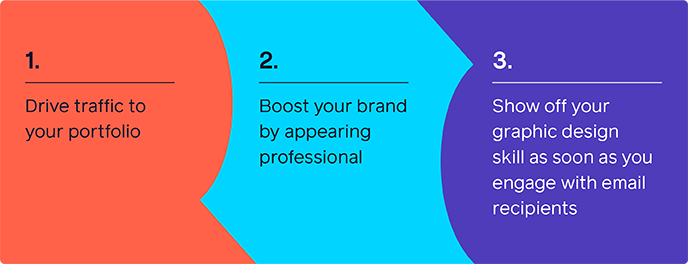
The end result? You make an impression, meaning you're top of mind when prospects make a buying decision.
In this guide, you'll learn:
- Why graphic designers need email signatures
- How to create and tailor your email signature
- How your email signature will help you get business
What are the benefits of graphic designer email signatures? 🤔
Let's face it:
Text-only email signatures are dull. Not only do they blend into the body copy of your email, they also don't showcase your graphic design skills.
On the other hand, tailored and designed email signatures can help build your brand, drive traffic to your site, and pay your bills.
That's because you can use them to showcase your graphic design talent, well before recipients click through to your portfolio.
Here are 3 other reasons why you need a graphic designer email signature right now:
It gives you a competitive advantage 🏆
Plenty of graphic designers neglect their email signatures.
So by having a stand-out one yourself, you've got a chance of getting ahead of the game.
It's a great marketing tool 🔧
A designed email signature isn't just one example of your talent.
By using social media icons that link your work, you can help guide prospects through the customer journey, and closer towards purchasing.
Meanwhile, the colour scheme you use and other features you incorporate will help reinforce your brand.
It'll help build your reputation ⬇️
It's simple:
A properly designed email signature looks professional and personal.
A "Sent from my iPhone" signature, on the other hand, looks unprofessional and impersonal.
So by investing in yours, you can increase trust with prospects and customers.
Graphic designer email signature best practices 🔝
Now you know why you need a professional graphic designer email signature, it's time to talk about how you can create one.
Below, you can find 5 best practices to follow:
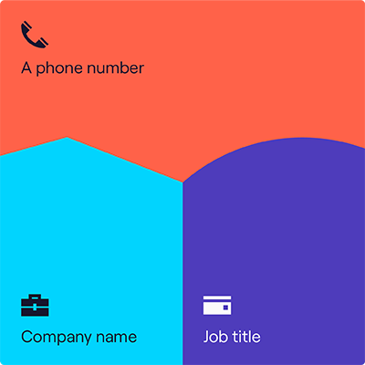
Include basic contact information 📞
Your email signature is pointless if it leaves your recipient with more questions than answers.
So be sure to include:
Show off your talent 💁
An email signature that’s visually appealing will immediately draw the recipient in.
To do this, you could:
- Opt for a visual illustration of your face instead of a photograph
- Use animated features, such as GIFs.
But be sure to input some checks and balances into your email signature. For example:
- Stick to a single font and colour palette, ideally those used as standard by you or your agency
- Don’t use too many animated features, so as to distract from the key information or your call to action (CTA).
Make it personal 👤
Email signatures have an option for visual features, such as images and photographs. Use them to your advantage, and reassure prospects and clients that they’re not talking to a bot.
Show you're credible ✅
Your email signature is a great way to show your qualifications to prospects and clients. So if you have a degree or a HND in graphic design, you could mention it in your email signature.
State what type of graphic designer you are ✏️
There are a ton of different types of graphic designer, including:
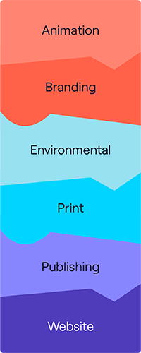
That makes stating your specialism in your email signature important. By doing so, you'll be able to nurture relationships with the right prospects and filter out the wrong ones.
How can I generate traffic with my graphic designer email signature? 🚦
Now you've got most of the key ingredients you need in your email signature.
But to take it to the next level, you need a CTA.
By using clickable icons, buttons, and banners that point recipients towards your work, you have a better chance of converting prospects into customers.
Below, you can find inspiration on how to use them effectively:
Use a clickable phone number ☎️
A clickable phone number makes it as easy as possible for prospects and customers to get in touch with you about general enquiries, quotes, or even progress reports on ongoing projects.
Use social media icons 🤳🏿

As a graphic designer, you may use Instagram and Pinterest to showcase your artistic inspirations or passion projects.
And by linking these accounts in your email signature, clients can connect to you and your work in a more meaningful way.
Tip: Ensure the contents of the social accounts you link are still professionally focused.
Clickable icon to your client portfolio ✏️
You live and die by the strength of your portfolio.
So be sure to include a clear link to your best work, and to any customer testimonials you have at your disposal.
Social proof is arguably the most powerful weapon in your arsenal to help prospects make buying decisions.
Clickable icon linking to an online calendar 🗓️
If recipients like what they see from your portfolio, they’ll want to contact you outside the email chain.
So make it as easy as possible for them to take the next step. Provide a CTA that links to an online calendar that shows your availability for meetings.
Key takeaways 🗝️
For the perfect graphic designer email signature, remember that it should:
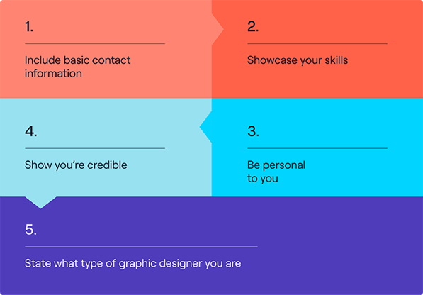
It can also help you generate valuable traffic through CTAs. More specifically, through:
- Clickable phone numbers
- Social media icons
- Links to your client portfolio and testimonials
- Links to your online calendar
You’re now all set to create a stand-out graphic designer email signature! Sign up for our free trial today and get started.



_Card.png)