How to get a CTA email signature that impacts your bottom line
Ever thought about adding calls-to-action to your email signature? Then this guide has got you covered. We'll tell you everything you need to know before you get started!
Adding calls-to-action on email signatures seems like an easy task.
Whether you’re linking to your products and services or plugging your latest content, there are tons of avenues explore.
But this amount of choice is also a trap. Because if you include every CTA under the sun in your email signature, your recipient won’t know which step to take.
To avoid this, what you need to do is pick the right CTA for your business’ needs right now, and change it whenever those priorities shift. You also need to focus on the email signature CTAs that will generate the most meaningful traffic to your site.
So, how do you do that?
Follow this guide, and you’ll be able to make the most out of the traffic that your email signature CTAs creates.
What is a CTA? 🤔
Calls-to-action are a series of clickable buttons, banners, and icons that help customers take the next step in their journey.
It could be directing them to a new piece of content, or a recently updated line of products.
What can I use CTA email signatures for? 🤔
With so many calls-to-action to choose from, it can be overwhelming to know where to start. So here’s some of the common uses for CTA email signatures.
Setting up meetings 📆
Make it easy for recipients to engage with you beyond an email thread by linking your calendar availability.
Plugging your content 👇
Promote webinars, blogs, white papers, eBooks, podcasts, YouTube videos, and more with clickable banners that give your content marketing strategy a boost.
Plugging your social channels 📱
Use social media icons to drive traffic towards your key social channels and build your audience.
Tip: Don’t include icons for the sake of it, especially if your audience doesn’t use or care about the channels you’re promoting.
Give company updates 📣
Tell employees and customers about important news, events, and initiatives.
Here are some examples:
Company newsletter: use your email signature CTA to drive signups to newsletters that help nurture prospects and customers.
Link upcoming events: drive sign-ups to in-person and online events by linking landing pages in your email signature CTA.
Advertise vacancies: include “we’re hiring” CTAs in your email signature to alert employees about internal opportunities.
Engage with your audience
Sometimes emails can feel like a one-way or impersonal conversation.
So with an email signature, you could take the opportunity to add a CTA that links to a poll or survey.
That way, your recipients can engage with your content or questions. And feel like they're part of a bigger or ongoing conversation.
Upsell your new products 👇
Converting new customers is much harder than converting existing ones. So ensure the army of fans you already have is aware of product updates and new features that can benefit them with email signature CTAs.
You then get notified that they’re going to be more expensive, because they’re going to be upgraded and changed.
Testing paid ads 💰
It’s a killer when paid ads tank and cost-per-lead (CPL) is through the roof.
So why not test different creatives before you spend your war chest on them? And designed email signature CTAs can help you do just that.
Adding credibility to you or your company ⬇️
By using an email signature CTA, you can redirect prospects towards customer success stories and reinforce trust in your brand.
CTA email signature best practices 🔝
Before you go any further, check out these tips. That way you'll make the most of your CTA email signature. 👇
Make sure the CTA is relevant ⬇️
This might sound obvious.
But the whole point of a CTA is to get recipients to take an action you want them to take.
So don’t waste your time on something that isn’t going to have a measurable impact on your business.
For example, there’s no point driving traffic to a YouTube channel that hasn’t had any uploads since 2012.
Make sure the CTA format fits 👇
Clickable CTAs come in different forms but before you add them in, here are a few things to consider:
Banners:
Banners are eye-catching, and they immediately grab the attention of the reader. But make sure they’re designed clearly and professionally, or they may not be as effective.
Sales and events icons:
You can shout about upcoming sales, reductions, and offers through these icons which are designed specifically to inform recipients about promotional content.
Buttons:
Buttons are by far the neatest and simplest of the three CTA features. You can get your point across in very few words and they’re great for linking social media profiles. All you have to do is insert the relevant logo and you’re sorted.
Make sure the CTA is proportionate 🕴️
Once you’ve chosen your CTA, make sure it’s an appropriate size, ideally 47.9 pixels tall. This will ensure the CTA isn’t pixelated and that your entire email signature looks professional. After all, if your CTA is hard to read, it could discourage people from clicking through.
Make sure the CTA phrasing is short and concise 💬
It’s important to keep the instructions in your CTA short and snappy. Because if the copy is fluffy, you’ll lose the recipient’s interest. Try using direct commands, like the ones listed below:

Make sure the CTA is compatible with different devices 📱💻
So you’ve set up your email signature CTA. Your next step is to check that it’s going to work on different devices.
It’s worth noting that with most email clients, designed image CTAs do work. But if you’re on an iPhone or an iPad, you can’t add icons and images on the iPhone and iPad manually. Instead, you can use a generator.
Make sure the CTA is personalised 👤
93% of emails are dull as dishwater. Ok, that’s not an actual stat, but you catch our drift. To make sure yours doesn’t get deleted on the spot, try adding a headshot of yourself.
This’ll help recipients put a face to your name and encourage engagement with the rest of your content.
Make sure the CTA design is simple ✏️
Sometimes, less is more. So when you are including images, think about how they contribute to the rest of your signature. And if they’re not adding any value, get rid of them.
Tip: Use “PNG” format images for CTAs in email signatures.
CTA email signature key takeaways 🗝️
Who knew there was so much to cover on CTA email signatures!
Here are the key points to recap:
CTAs are a series of buttons, icons, and banners that help instruct recipients to take their next step in their customer journey. So CTAs make sure your email signature is interactive.
CTA email signatures can be used to:
- Set up meetings.
- Plug content and social media accounts.
- Give recipients company updates.
- Upsell new products.
- Test paid ads.
- Add credibility to your company.
Remember to choose a CTA that:
- Is relatable to your business needs.
- Is proportionate with the rest of your email signature.
- Is simple in terms of phrasing and design.
- Is compatible with your device.
- Is personalised.
CTA email signature FAQs 🙋
What is the purpose of a CTA in an email?
An email CTA extends the relationship between the recipient and sender beyond an email chain. And when the sender tries to solve problems for the recipient, trust can be built.
Designed email signatures with CTAs also allow you to promote content, offers, events and more and are far more effective than text-only URL links.
How do you write a good CTA?
First, use a strong verb to open. Commands such as “buy”, “download”, “order” work well.
Second, make sure you offer value. Your CTA should have a clear intention. For example, solving a problem for the recipient, or offering them a clear benefit, such as a 30% off discount code.
How can I make my CTA stand out?
- Use clear and concise language.
- Use icons, images, and colours to make it visually appealing.
- Make your CTA scannable; it should be one of the first things the recipient sees.
Is “learn more” a good CTA?
“Learn more” is a great way for the recipient to find out more about you or your company’s content. It’s also useful because CTAs in general can’t fully cover or capture what you or your company has to offer.
But it shouldn’t be used in every marketing campaign. As “learn more” is a low ask, it works well for prospects beginning their customer journeys. However, “learn more” would likely turn off a prospect who was ready to buy, as the CTA doesn’t match their intent.
How do I make my CTA clickable?
Make it obvious. Don’t leave the reader confused, meaning they have to hover over the icon/banner/button, to see if there’s a link. This should be clear from the moment the reader sees your CTA.
What can I say instead of “learn more”?
“Learn more” is great for TOFU campaigns. But if you want to use something else, consider these phrases:
- “Get more information”
- “Find out more”
- “I’m interested”
What colour button gets the most clicks?
It depends on what the aim of your CTA is. Some colours stand out, and some link to certain functions:

Are CTAs just for email signatures?
CTAs are clickable icons that can also be used on:
- Individual emails: instead of a signature, you can place a CTA within the email itself.
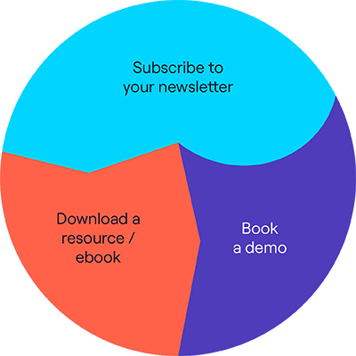
- Websites/Blogs: CTAs can be used throughout websites and blogs to make sure the reader doesn’t bounce off. For example, you may encourage them to
How do you put your signature on an email?
Depending on the device and your email client, the process is different. Find our Apple, Gmail, Outlook, and Yahoo tutorials here.
What makes a good email signature?
A good email signature will include:
- Your name.
- Your basic contact information.
- Your job title.
- Your company.
- Relevant CTAs.
- A high-quality photo of yourself.
Remember to keep it professional: don’t overdo it with colours and images, otherwise the overall signature will look too busy.
Don’t put on every social media icon or CTA under the sun: choose the ones that are going to be the most useful, so you don’t overwhelm the recipient.
Hint: think of your email signature as an electronic business card.
And there you have it! That's everything you need to know about creating a CTA email signature. So don't wait any longer, and sing up for our free trial today.
