The New Mailtastic
We've redesigned the digital future - in coral
An exciting and successful year 2019 is almost over but we still have some exciting news for you: After our foundation in 2015 we have not only modified our complete appearance, but have also added a new website. Our product is also waiting with a whole handful of new functions to make our marketers' daily work even more successful. How, where, what and why did I asked my colleague Peer Wierzbitzki. So let yourself be surprised.

Interviewer
Co-Founder Mailtastic
Today we are talking about the "New Mailtastic" - what is it?
In fact, Q4 2019 brings the finishes of several major projects that we have been working on over the past weeks and months and that complement each other wonderfully.
On the one hand, we have published our latest marketing product Mailtastic "Target" (more about this later), we have adjusted our plans and launched the new website with new content and new corporate design.
The fact that all this is now appearing relatively simultaneously has given the whole thing the working title "The New Mailtastic", which has now made it into this blog post.
Why the rebranding?
Yes - I have to admit, our corporate design did not have the highest priority when we founded Mailtastic 2015. Of course, a solid corporate image was important to us even then, but in recent years we have developed so strongly as a company in so many relationships that we have come to a point where the old CD no longer felt right. I think you can say that we have developed a new identity that we want to express with the new corporate design.

Why does the new design look the way it does?
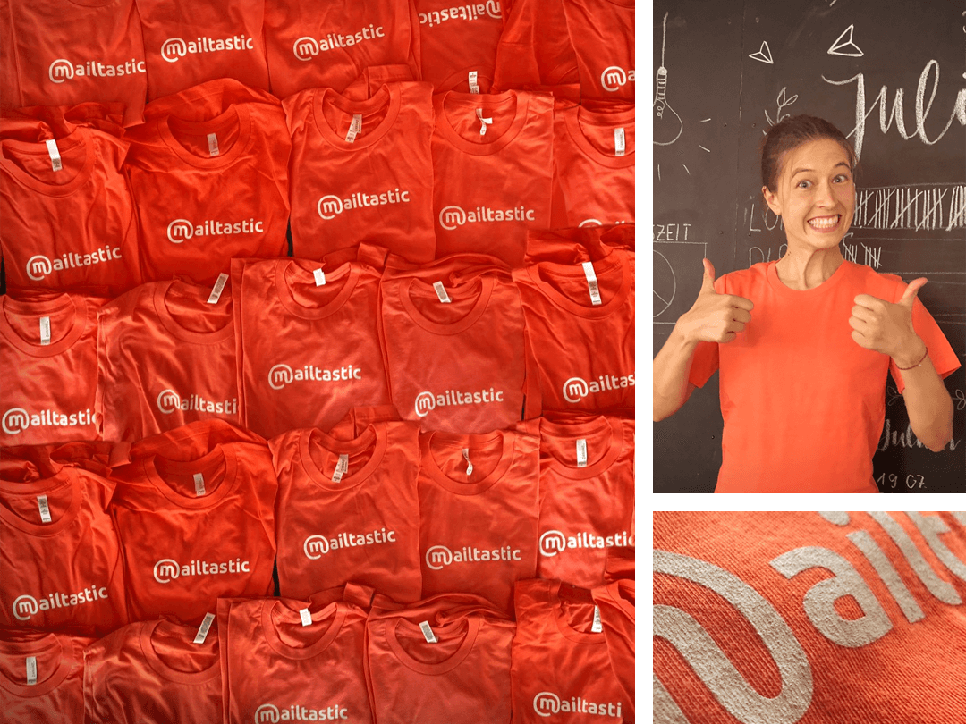
The most obvious is certainly the color change from blue to coral. Blue was a very suitable colour for our start in 2015 - it looks serious, arouses confidence and looks somehow ... familiar. Good qualities when you, as an unknown startup, want to conquer the companies of this world with a product that at first glance might seem unusual and depend on a certain amount of trust. But not only we know this, many others know it too. So it is not for nothing that blue is the most popular corporate colour of all and is used correspondingly frequently. We feel much more comfortable with the new colour.
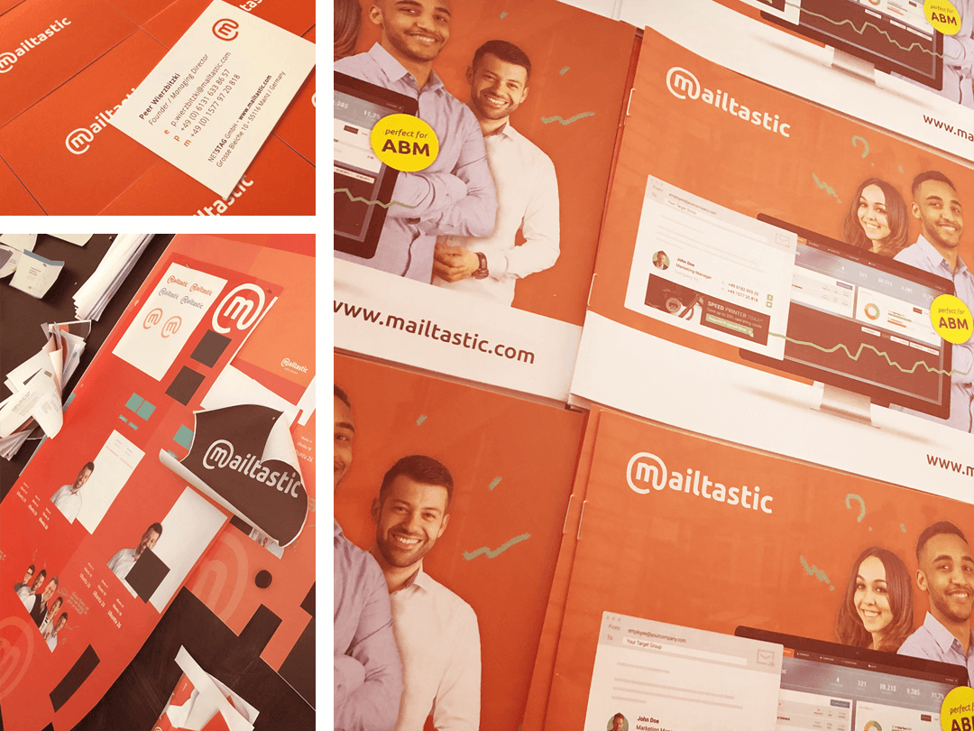
In addition to the colour, the visual language is also particularly important for the correct tonality. As a software provider, you often run the risk of combining complicated function images with generic stock photos. Of course we are a software provider, but we definitely wanted to reflect the very personal way we work with each other and with our customers in our communication. Instead of anonymous stock photos we used real photos of real employees and instead of technical renderings we decided to use illustrations. I'm a big fan of illustrations because they're at least as good at explaining functions and relationships as they are at giving the communication that personal, individual touch that's important to us.
Overall it was important for us to convey that we are not one of those faceless no-touch software companies where every customer is just an ID, but that behind our software there are real and enthusiastic people who enjoy their work, who enjoy interacting with other people and who personally take care of the concerns and projects of our customers.

Why the new color?
I don't think we need blue anymore to be serious. Our competence and expertise is now reflected in a number of national and international clients and their results. So we were quite free in our choice of colours and asked ourselves which colour we felt most comfortable with and which colour our company best reflected. Coral is a very positive, stimulating, present and modern colour. It suits us and what we do and sell. It is even the colour of the year 2019 - but that had no influence on the selection.
What else is new?
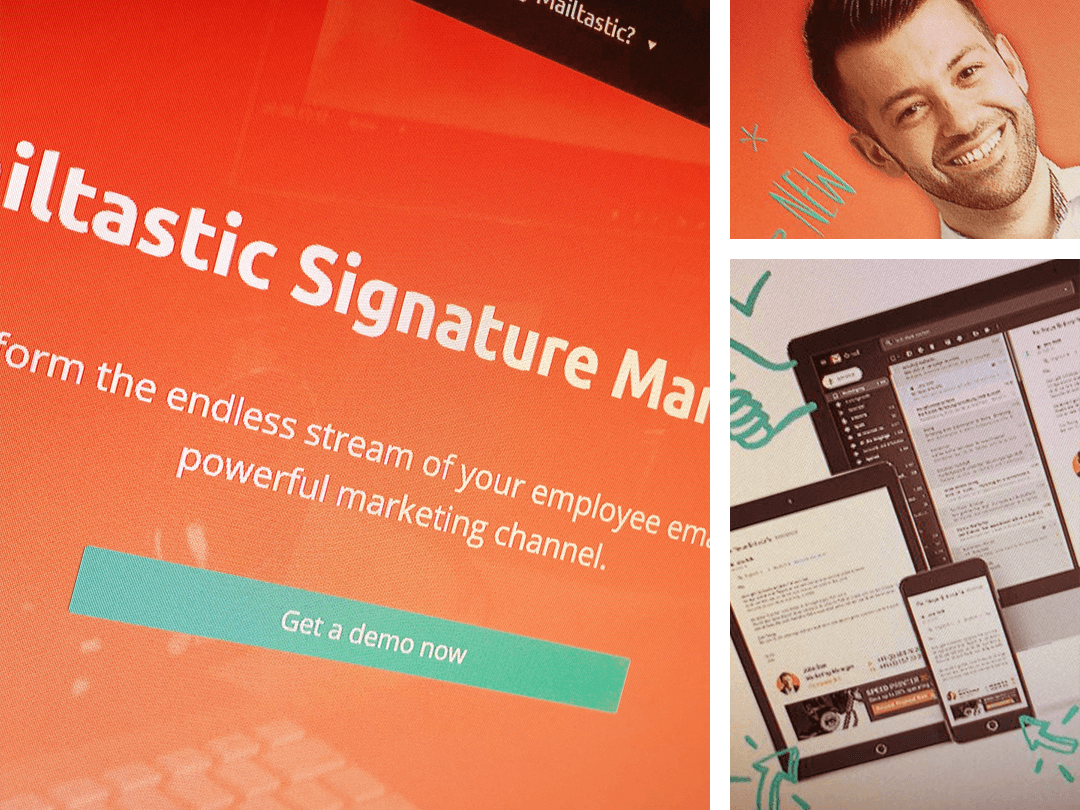
It was time for a new website - finally it is there - at least the first big part. In the last months we have created a lot of new content, which was not to be found on the old website at all or only very inconveniently. In the course of the new design, but above all in order to finally present our new product range and the new tariffs clearly, we have bought ourselves a new website, which is now growing daily. Helau!
Who has desire and time, finds here now more content- better structured.
Also on the website are our new products and rates - Basic, Advanced, Target and Enterprise - which are now even better tailored to the needs of our current target group.
First of all: all details about the new products can be found soon in a separate article.

What can be expected from the "New Mailtastic" in the future?
So basically it has to be said that with the "New Mailtastic" we have not introduced any new hip values or do everything differently from one day to the next. Rather, the many content and formal innovations are the result of the hard work of recent months and expression of the grown self-image that we as a company and above all as a team have developed since our foundation.
In a nutshell: So in the future we will be able to look forward to a Mailtastic that has a clear goal and that in the way we have practiced it from the beginning: Solutions that are tailored to the needs of our users, outstanding service and a very personal contact with our customers ... but in a new look that suits us better!

Would you like to know more about Mailtastic?
In a live demo, we will present our platform to you and show you how your company can generate new successes through targeted signature marketing.


.png)
